

Analytic Flying’s Capacity Tracker: November 2023 Update
Last month we launched Analytic Flying’s Capacity Tracker allowing users to explore international airline capacity to and from Australia for different cities, airlines, countries, and regions on a monthly basis. The initial purpose was to track post-pandemic capacity returns but the increased functionality due to this month’s update provides users with a tool to consider broader market analysis by adding dynamic filtering allowing filtering by one or many airlines, cities, countries, or regions simultaneously.
Analytic Flying’s Capacity Tracker has two distinct advantages. Firstly, the tool complements and supplements official BITRE data that is subject to reporting delays by exploiting ADS-B aircraft tracking data to ensure data is available in near realtime. So while BITRE data is only available through the end of August 2023, Analytic Flying’s Capacity Tracker is updated to the nearest completed month.
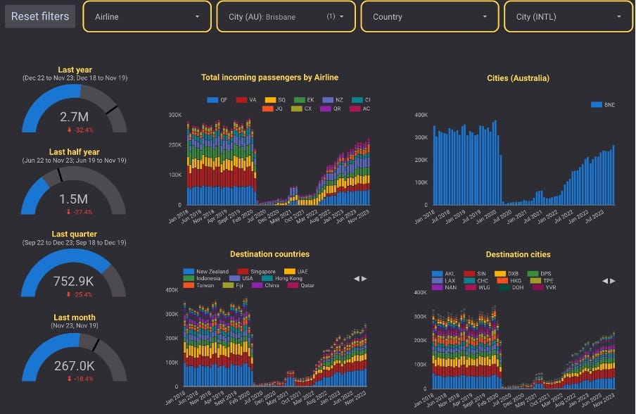
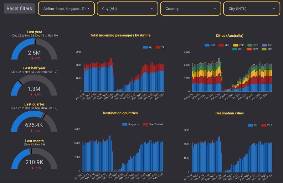
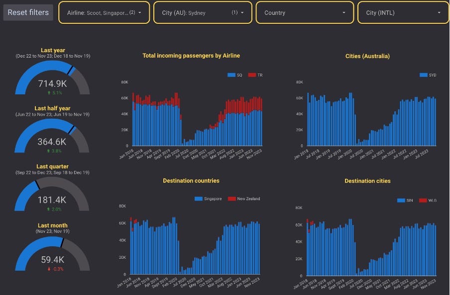
Additionally, Analytic Flying’s Capacity Tracker is made available through an easy-to-use data visualisation tool, allowing users to easily compare and contrast data. Want to look at capacity trends to Melbourne (MEL)? It takes just one click! Want to look at the MEL trends for just Singapore Airlines (SQ)? Easy, just click on the “airline” drop-down menu and click on “only” next to SQ! What about SQ and Scoot (TR) combined? Just click on the drop-down menu again and click the box next to TR. Easy!
Over the weekend, we also updated the database by adding data for November, but also correcting a few errors (including some errors with an airline name, a aggregation correction to another airline, adding three regional routes that had been missed in the ADS-B database, and confirming a few errors in the BITRE data). But we also thought it would be a good time to analyse some recent trends to highlight the functionality of the tool.
Overall capacity return
International airline capacity remains significantly down compared to the pre-pandemic period. Recent reports highlighted that Air Services Australia data for November 2023 shows that international air traffic was 92% of the pre-pandemic level. However, as our capacity tracker shows, this return has been uneven over time with the return gaining pace in recent months, but has also been unevenly distributed by city, airline, region, and country.
In total, over the last year (12 months from December 2022 to November 2023), total capacity was down 17% compared to the same year pre-pandemic (12 months from December 2018 to November 2019). However, over the last quarter, capacity is down by significantly less (only 11%), and over the last month only 7%, highlighting the increasing pace of capacity returns.
Capacity return by city
Capacity return has generally been uneven with capacity favouring Australia’s two gateway airports of MEL and Sydney (SYD). This trend has remained consistent in both longer- (i.e., over the last year) and shorter-term capacity returns (i.e., last quarter and month). Brisbane (BNE) and Perth (PER) have suffered with slower returns, with BNE being the weakest, hit harder by the loss of Virgin Australia’s (VA) international flights to the United States and New Zealand. BNE’s weakness has also been compounded by very slow capacity returns at Gold Coast (OOL) due to the loss of capacity from the cancellation and slow return of several LCCs.

Capacity return by airline
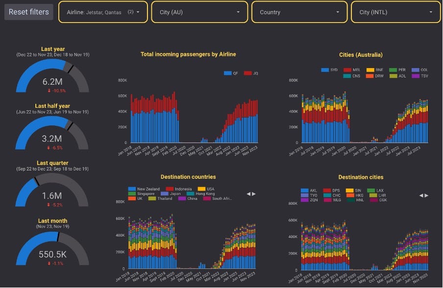
Most airlines flying to and from Australia are providing less capacity than they did pre-pandemic. Only three of the top 10 airlines have matched or exceeded their pre-pandemic capacity over the last year. Qatar Airways (QR) have seen an impressive capacity growth resulting from additional frequencies granted in 2022 and the creative use of frequencies to secondary cities and increased aircraft size on several routes.
Jetstar (JQ) and Scoot (TR) have also increased capacity, partially compensating for capacity declines from their mainline sister carriers Qantas (QR) and SQ. While QF was down 17% and 5% over the last year and month respectively, when combined with JQ, group level capacity was down 11% and 1%, respectively. Comparatively, while SQ was down 18% and 16% over the last year and month, once combined with TR, group level capacity was down 4% and 7%, respectively. These figures may surprise some given the narratives regarding QF and SQ during recent debates on market access for international airlines.
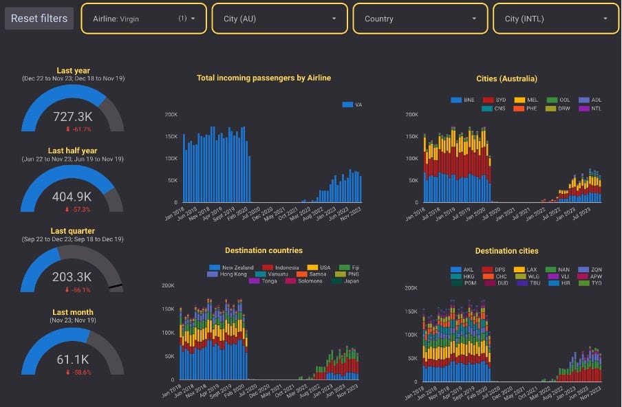
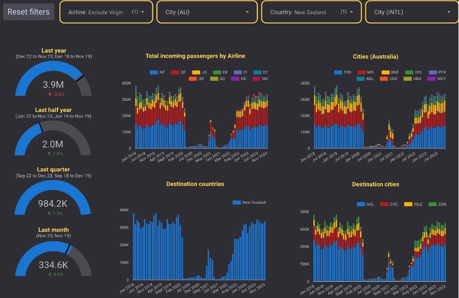
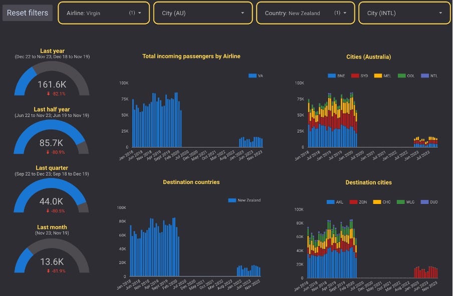
VA is the most significant contributor to the loss of international capacity, with capacity down 62% over the last year, and 58% and 59% over the last quarter and year, respectively. As previously indicated, this is due to the cancellation of VA’s services to New Zealand and the United States, and to a lesser extent Hong Kong. VA have increased capacity to Indonesia but this has not been sufficient to offset capacity losses elsewhere.
An additional point of analysis is the increasing trend of legacy carriers like QF and SQ segmenting lower yielding traffic onto a lower cost platform. In the case of SQ, it is evident how group-level capacity has been substituting SQ mainline capacity at MEL, PER, and SYD with TR. TR is filling a significantly higher proportion of capacity post-pandemic. BNE has suffered as a result since TR do not serve BNE but rather served nearby OOL. TR did return to OOL in Feb 2022 before cancelling the service in July 2023. SQ continues to secondary cities using the mainline brand and capacity has returned strongly to Adelaide (ADL), Cairns (CNS), and Darwin (DRW). Thus, BNE and OOL are almost entirely responsible for SQ group’s loss of capacity post-pandemic. Excluding BNE and OOL, capacity is up 0.2% over the last year! This analysis highlights the usefulness of the capacity tracker tool.
Capacity return by country and region
Capacity losses have also not been equal across countries, and by extension regions. Capacity to Oceania has suffered, with capacity down 14% over the last year, but improving to a loss of 12% and 2% over the last quarter and month, respectively. This has been driven by trans-Tasman routes, with capacity down 17% over the last year, but improving to a loss of 16% and 12% over the last quarter and month, respectively, ostensibly due to the loss of VA’s New Zealand routes. Excluding VA, trans-Tasman capacity is only down 3% over the last year, and has increased 1% and 5% over the last quarter and month, respectively.
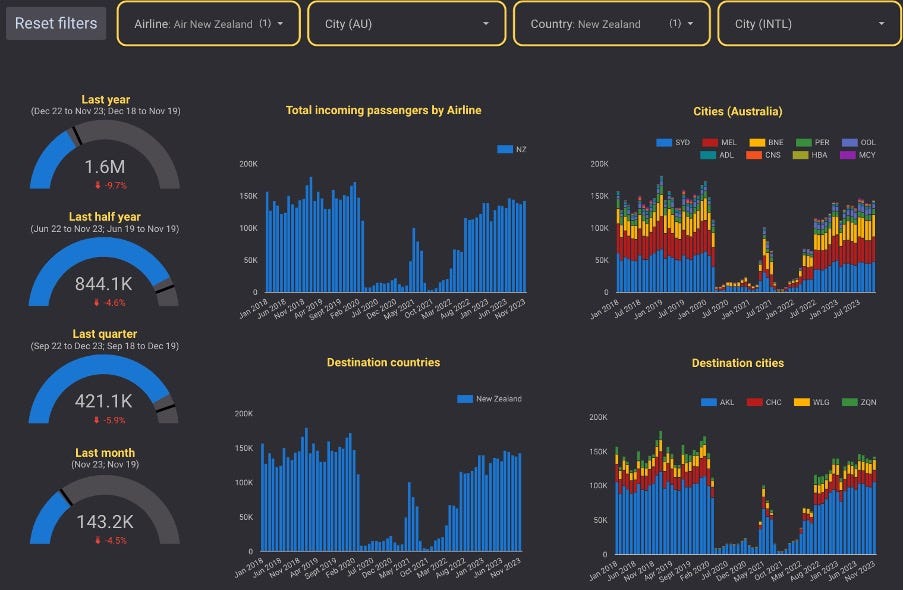
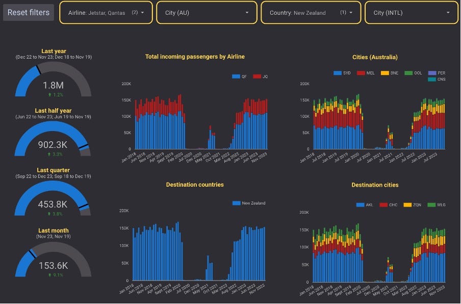
VA’s capacity loss has been compounded by capacity loses from Air New Zealand (NZ) (down 10% over the last year, and 6% and 5% over the last quarter and month, respectively). QF and JQ have been responsible for the capacity increases, with combined capacity increasing 1% over the last year, and 4% and 9% over the last quarter and month, respectively. Notably, both brands have contributed somewhat equally with QF’s capacity coming from BNE and SYD, and JQ’s growth from BNE and OOL. This is not surprising given that VA’s historic trans-Tasman capacity was concentrated on BNE. Once again, this highlights the usefulness of the capacity tracker tool.
Other regions and countries to experience significant capacity loses include East Asia, led by slow capacity returns from China due to their slower post-pandemic reopening. Capacity returns have increased significantly in recent months, but East Asia is still behind other regions. West Asia has also been slow as a result of slow returns from the United Arab Emirates. This can be ascribed to slow capacity returns by Emirates (EK) and Etihad (EY), while increases by QR have not been sufficient to offset the losses. These losses have been somewhat offset by very strong performances to South Asia, driven by large increases to India resulting from QF’s new services to Delhi (DEL) and Bengaluru (BLR), and slower decline to Southeast Asia where increases to Indonesia have partially offset slow returns to Singapore.
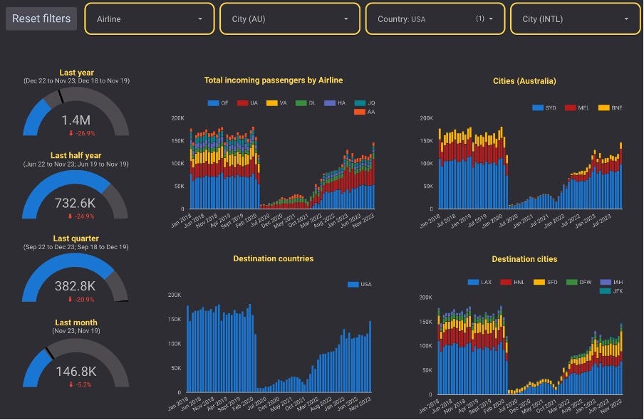
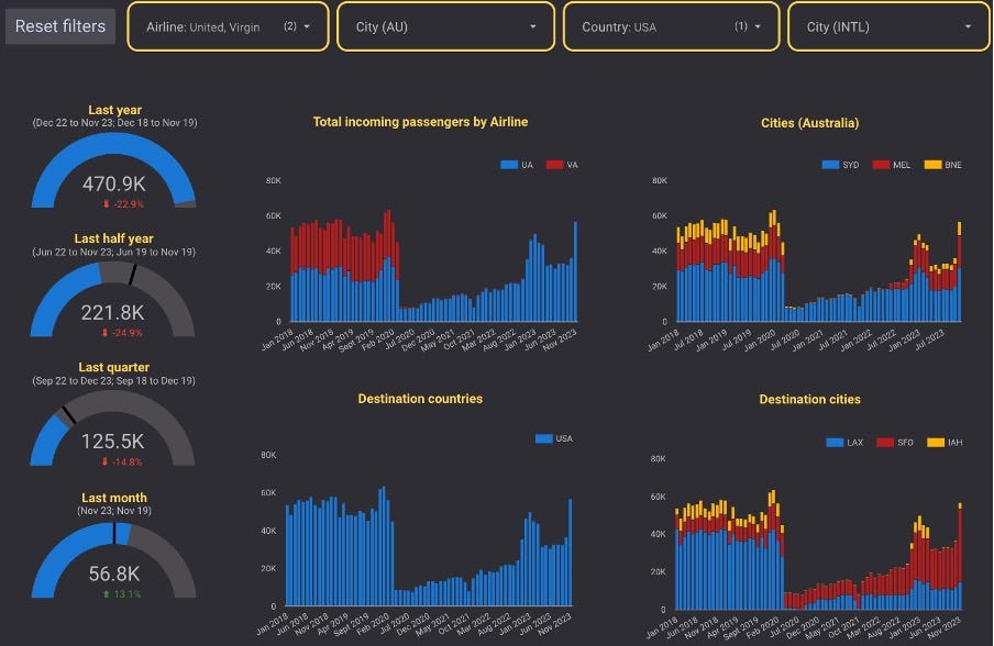
The Americas presents an interesting case study, with capacity down 26% over the last year, but only 6% over the last month. The Americas is dominated by the United States, with smaller capacity to Canada and Chile. Capacity to and from the United States suffered considerably from the cancellation of VA’s routes from to Los Angeles (LAX). United Airlines (UA) have been the biggest gainers with capacity up 52% over the last year, and an extraordinary 63% and 93% over the last quarter and month.
In recent weeks, some commentators have gone as far to claim that UA has surpassed QF as the largest carrier between Australia and the United States. UA achieved this dominance during the month of November and, in fact, achieved the same dominance last summer. Notably, UA‘s capacity has greater seasonal variations than QF who was the capacity leader during much of the year. Furthermore, this comparison ignores JQ‘s Honolulu (HNL) services and at a group level QF still leads capacity during most months. Furthermore, one might argue that UA and VA’s combined capacity should be considered given their now very close partnership, such that UA have effective taken over VA‘s domestic feed. UA and VA‘s combined capacity is still 23% down compared to the pre-pandemic baseline.


Conclusion
Analytic Flying’s Capacity Tracker is a useful tool to track car time, segmenting data by city, airline, county, and region. It is also useful to examine market trends and highlight airline strategy. The most recent data highlights a number of key trends:
Post-pandemic capacity was slow to return but has gathered pace significantly in the most recent months.
Capacity has not returned equally, with MEL and SYD performing the best, with BNE suffering the slowest capacity returns.
Airline capacity returns have been unequal with several airlines particularly slow to return capacity, with Emirates and Virgin Australia contributing to large capacity losses, and Qatar Airways being the largest growing; there has also been a noticeable shift in capacity from mainline to low-cost carriers within the Qantas and Singapore Airlines groups.